


Cultivating Clarity Typographic Book
For this project, I learned a new programming language and used Processing to create a typeface and various designs, which I then compiled into a book. It was a challenging experience since coding and typography are not typically combined, but I gained valuable skills and am proud of the final result.
Book Snippet:
Here is a selection of my favorite pages from the final book. I hope they encourage you to slow down, engage with the design, and truly appreciate the work.
Here is a selection of my favorite pages from the final book. I hope they encourage you to slow down, engage with the design, and truly appreciate the work.

I wanted this book to be more than just a showcase of a typeface. My goal was to help readers slow down and truly take in what’s in front of them.

This is the starting portion of the alphabet I designed using Processing.

To conclude this series, I chose to bring the book back to its typographic roots. This project was both challenging and transformative, evolving through several iterations before reaching its final form.
I wanted this book to be more than just a showcase of a typeface. My goal was to help readers slow down and truly take in what’s in front of them.

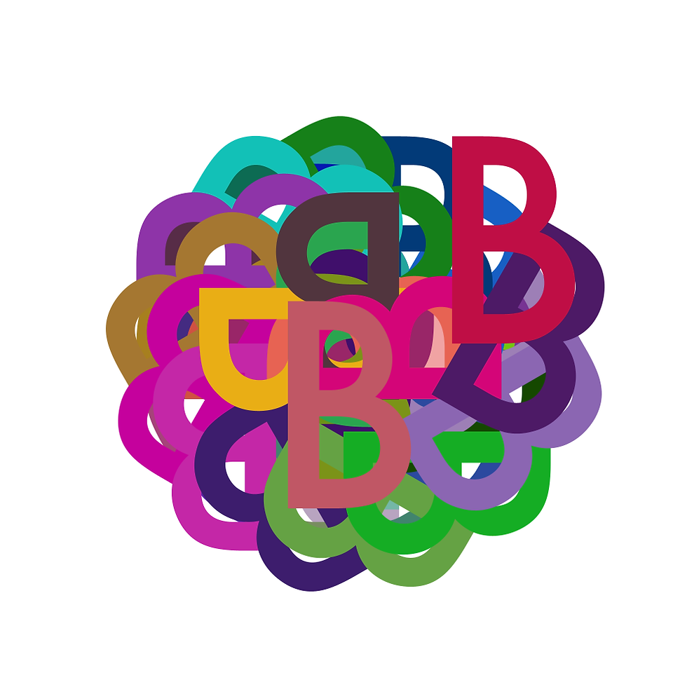

Constructed Alphabet
The first step in this process was creating an alphabet. Displayed on the left is the final version I designed. The letters are intentionally subtle within the design, encouraging readers to slow down and carefully decipher what’s in front of them.
The Process
Below is a screenshot of the a line of code that created the design on the right.
